ChargerGoGo App
Designing a Seamless Consumer Charging Experience
Simplifying the journey from finding a nearby station to renting, using, and returning a portable charger.
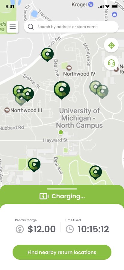
How might we make an unfamiliar physical charging service feel as intuitive as an everyday mobile application?
Overview
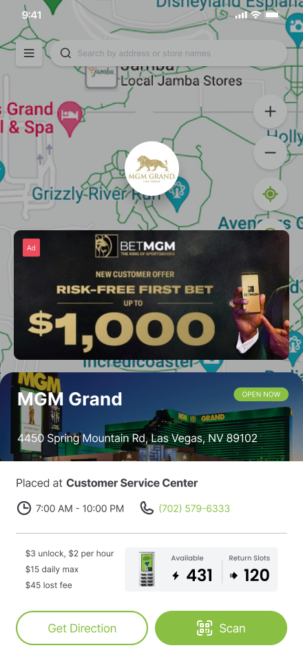
The ChargerGoGo consumer app connects people with portable charging stations available at participating venues.
Unlike conventional digital services, the experience crosses the boundary between a mobile application and physical hardware.
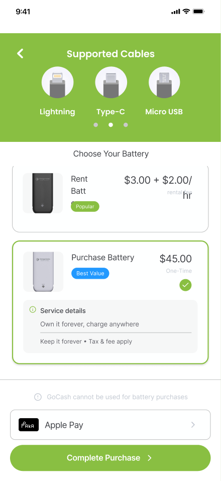
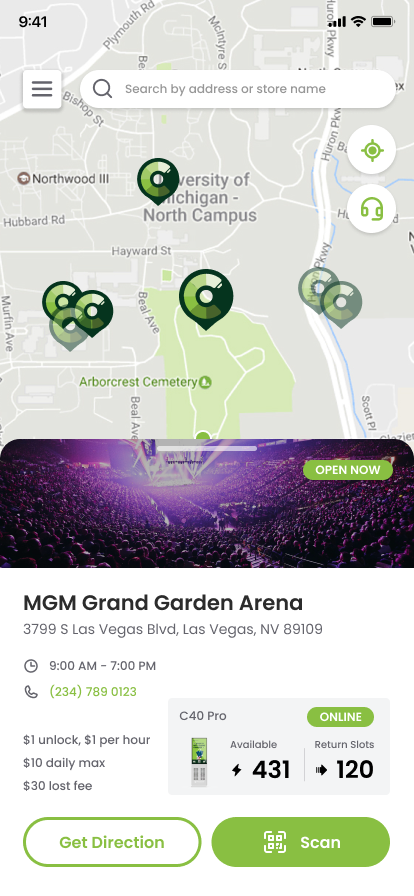
Users must discover an available station, initiate a rental, retrieve a physical charger, and eventually return it.
The app plays an important role in making those interactions understandable and convenient.
The Problem
A person looking for a portable charger may have limited battery life, little time, and no previous experience with the service.
The application must answer several questions quickly:
- Where can I find a charger?
- How do I start a rental?
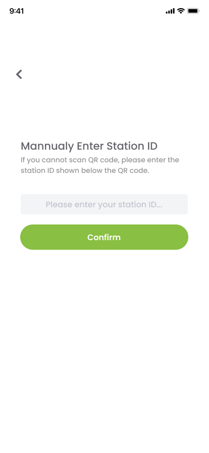
- What happens after I scan a station?
- How do I know my rental is active?
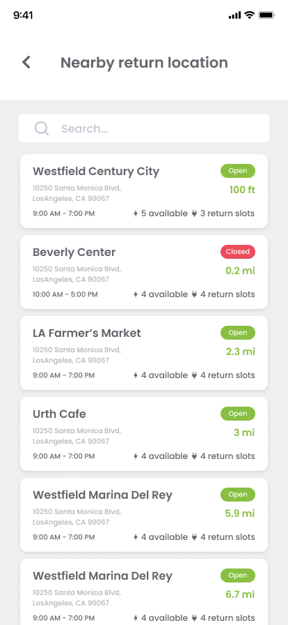
- Where and how can I return the charger?
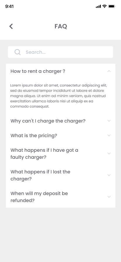
- What do I do if something goes wrong?
Each additional step or unclear interaction can introduce friction into a time-sensitive experience.
Design Goal
Create an intuitive mobile experience that reduces uncertainty across charging-station discovery, rental, and account management.
My Design Approach
Understanding the End-to-End Journey
I considered the experience as a sequence of interactions spanning both digital and physical touchpoints.
The design needed to support users from discovering a station through completing their rental, with clear transitions between each step.
Establishing Clear Interaction Hierarchy
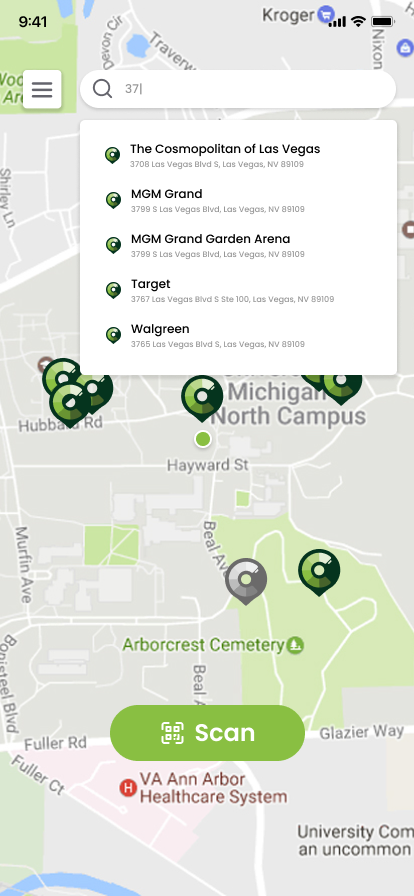
Primary actions should be visually prominent, especially when a user needs to perform an immediate task such as scanning a station or checking an active rental.
Secondary account-management actions should remain discoverable without competing with the central charging experience.
Designing Consistent Components
The Figma design system includes reusable button patterns and multiple interaction states, including standard, pressed, hover, and disabled variants.
These patterns support visual consistency and clearer interaction expectations across the application.
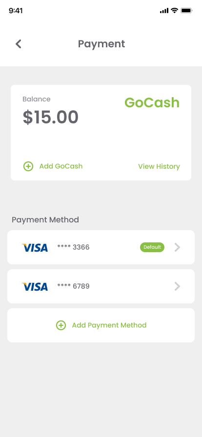
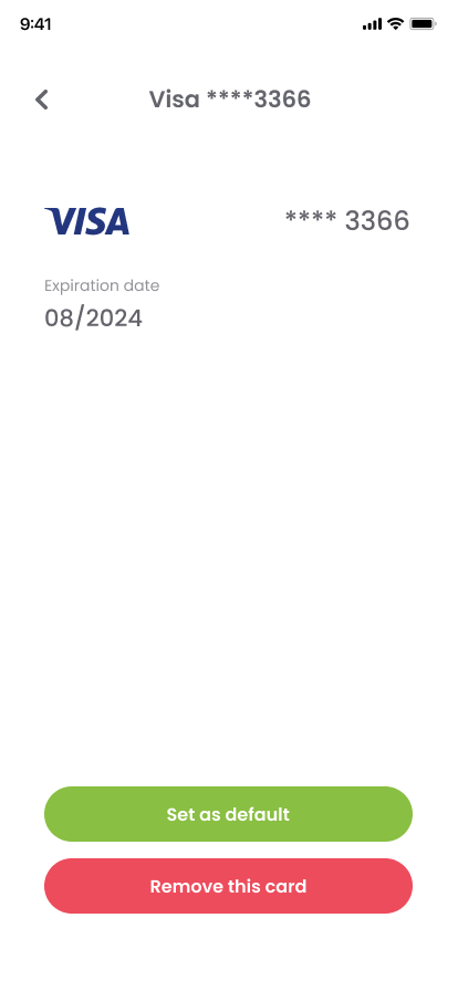
Improving Account Management
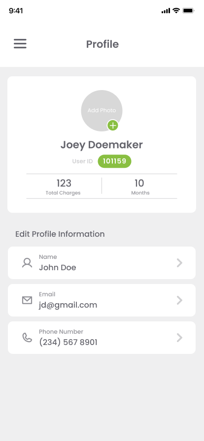
The profile design includes personal information, account details, and profile-photo editing.
For the profile-photo flow, the interface presents users with familiar options such as taking a photo, choosing an existing image, or canceling.
This is an example of using established mobile conventions to make a secondary workflow understandable without additional instructions.
Key Design Decisions
Make the Primary Action Obvious
The interface should help users move directly toward finding or renting a charger.
Use Familiar Mobile Patterns
Common interactions, including profile editing and navigation, should follow recognizable conventions wherever possible.
Design for Different Interaction States
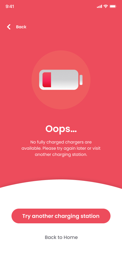
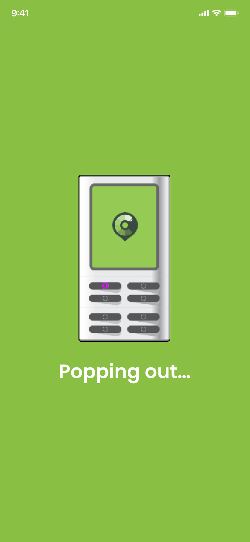
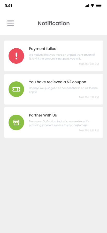
Loading, disabled, active, and error conditions are part of the experience and should be considered alongside ideal workflows.
Connect Digital Feedback With Physical Actions
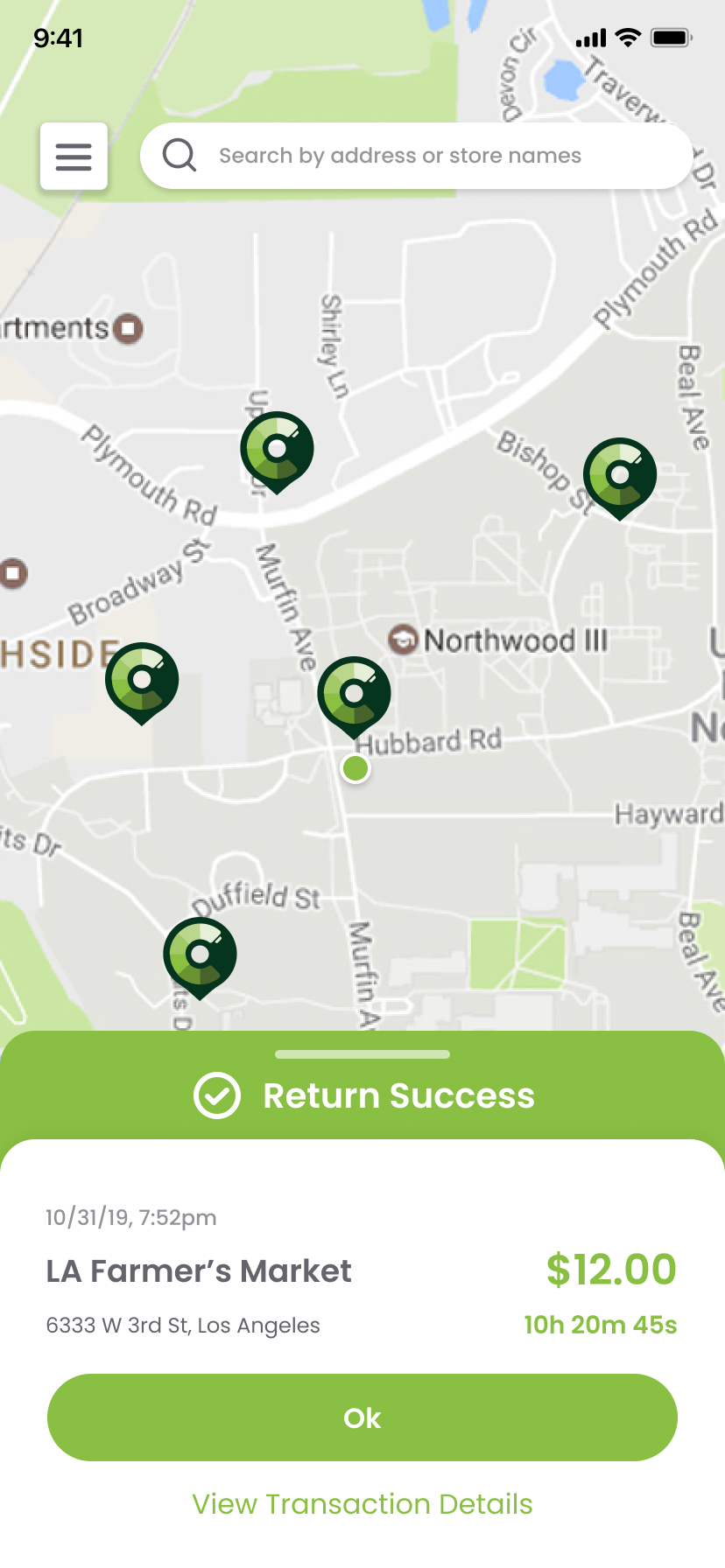
The application should make it clear when an action involving the charging station has been initiated, completed, or requires additional attention.
Design Reflection
Designing a consumer application connected to physical hardware requires thinking beyond individual screens.
The user's experience depends on how well digital instructions, transaction states, and real-world interactions work together.
This project reinforced my belief that good interaction design should reduce uncertainty and make the next step feel obvious.